HelloGbye
An exploration in travel, trust, and AI.
Introduction
HelloGbye (now Amgine) sought out to help Travel Management Companies (TMCs) modernize and automate parts of their travel agents’ workflow through the use of AI to produce itinerary recommendations.
The COVID-19 pandemic, however, threw major wrenches in the travel industry that stressed an urgency for HelloGbye to explore how the needs of our customers have changed. This case study will discuss a research project that the product and design team conducted to do exactly that.
Project Information
Project Start
Project Start
November 2020
Team
Product Owner
UI Designer
UX Designer (me!)
Project Components
Customer Interviews
Analysis of Findings
Ideation
Prototyping
Objectives
Objectives
- How has COVID-19 changed the needs and day-to-day workflows of our customers and users?
- What adjustments, features, or ideas can we add to our product that would address some of these concerns?
Note: I have intentially omitted data and information throughout this case study for confidentiality and conciseness.
Context
Our Clients
- Travel Management Companies (TMCs) that employ travel agents to help corporate travellers manage travel.
Current Agent Tools
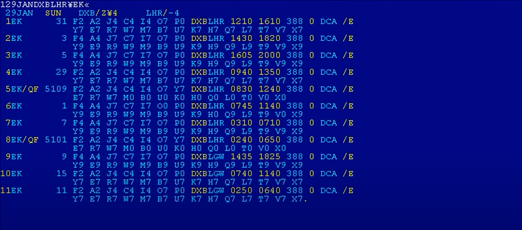
- Most TMCs and travel agents use legacy systems called GDSs that operated on command-line based entry, and thus pose a high learning curve.
Example screen of a GDS interface. (Source: altexsoft)
Interviews & Findings
Target
- Speak to 5 buyers (TMC senior leaders), and 5 users (travel agents).
Preparation Efforts
- Created two sets of question guides (one for each participant type)
- Google Form to collect sign-ups
- Email templates for booking confirmation, reminders, and “Thank you”s
- Organized schedule for sending those emails out
- Gift cards as sign up incentives and to thank them for their time
It seemed like we were all set to start our interviews.
Roadblock: Participants Dropping Out
By the commencement of the week we had set for interviews, we had not reached our goal of having 5 TMC leaders and 5 travel agents sign up to be interviewed.
Some of the participants expressed concerns or dropped out of their scheduled interviews due to concerns about confidentiality and being recorded.
The Fix: Increase Transparency
We reviewd the materials and processes we had set up for the project and adjusted it to detail and emphasize the terms of confidentiality and how the recordings would be used from the first touch point.
This seemed to solve the problem, as no further concerns were brought up and no other participants dropped out. We were able to meet our goal of interviewing 5 TMC Leaders.
As for low agent turnout, we uncovered something during the interviews that could be a potential reason for this, which will be addressed below.
Findings
Interview Insights
Of the valuable insights we gained from the interviews, here are the key points that addressed the questions we had set out to answer, and had the largest influence on our solution ideation:
- COVID-19 caused TMCs to shift their focus towards nurturing existing customer relations as a means of survival.
- Some TMCs furloughed up to 90% of their workforce, meaning remaining agents were taking on a massively increased workload.
- Remaining agents were spending more time on researching health and travel restrictions.
- Travel agents and travellers have differing preferences and levels of familiarity of technology types, causing friction.
Results
These findings validated our value proposition. If we could provide the following things, we could potentially improve our customers working experience:
- Reduce the time it takes from travellers submitting the travel request to itinerary acceptance, theoretically improving customer relations, and helping agents to manage their increased workload.
- Employ UX/UI to bridge the gap in technological preferences and familiarity between agents and travellers.
- Build in features that emphasize and aid customer service initiatives, such as customer profiles, which would help agents who are taking over for colleagues to have more access and clarity for each transaction.
These points were vital to us as, again, no previous user and customer research had formally been done to validate our value proposition to the travel industry, and would also serve to frame our understanding and knowledge going into any product development work. However, the complications of pitching a product with little to no formal user research revealed themselves in the insight about differences in technological preferences.
Roadblock: Agent Distrust of GUI
If you remember from the Introduction, GDS systems which travel agencies employ and are accustomed to operate using a text-based terminal to run searches. This means that codes need to be memorized through years of experience, thus producing a high learning curve. Travel agents cited prefering this format because:
- GDSs were extremely fast to use after you got the hang of it
- Offered the flexibility of making more customized searches, and therefore
- Invoked feelings of transparency and reliability
Our proposed GUI would operate through point-and-click functions you would find in an online booking tool (OBT), such as Booking.com, or Google Flights.
Our interviews revealed that agents were distrusting of GUI tools and held apprehension towards using them. Many of their impressions of GUI was that they were slower, unreliable, and dissatisfying.
This posed a problem for us because these perspectives and feelings towards GUI meant that our platform could face adoption and usability issues.
The Fix: TBD
At this stage, we didn’t have an answer. It was clear that this was an area that needed further testing. This would also have to be addressed in our solutions in the following ideation sessions and be a large factor in our user stories moving forward.
Synthesis & Analysis
Methods Employed
- Debrief Meetings - to discuss each interview and to consolidate notes
- Interview Transcription - to make searching and tagging quotes easier
- Tagging - to group similar points raised by participants
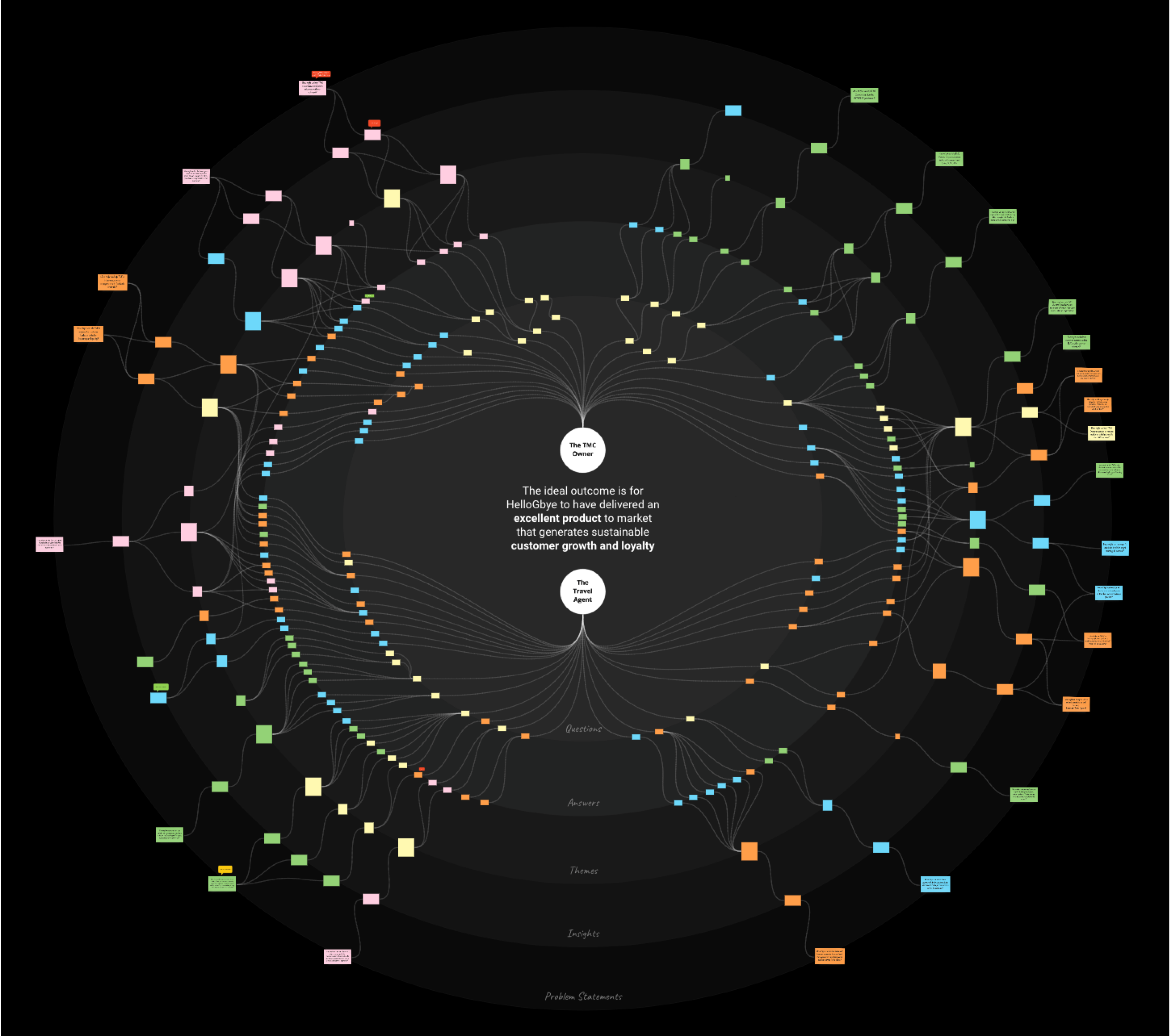
- Mapping - to visually display themes and patterns
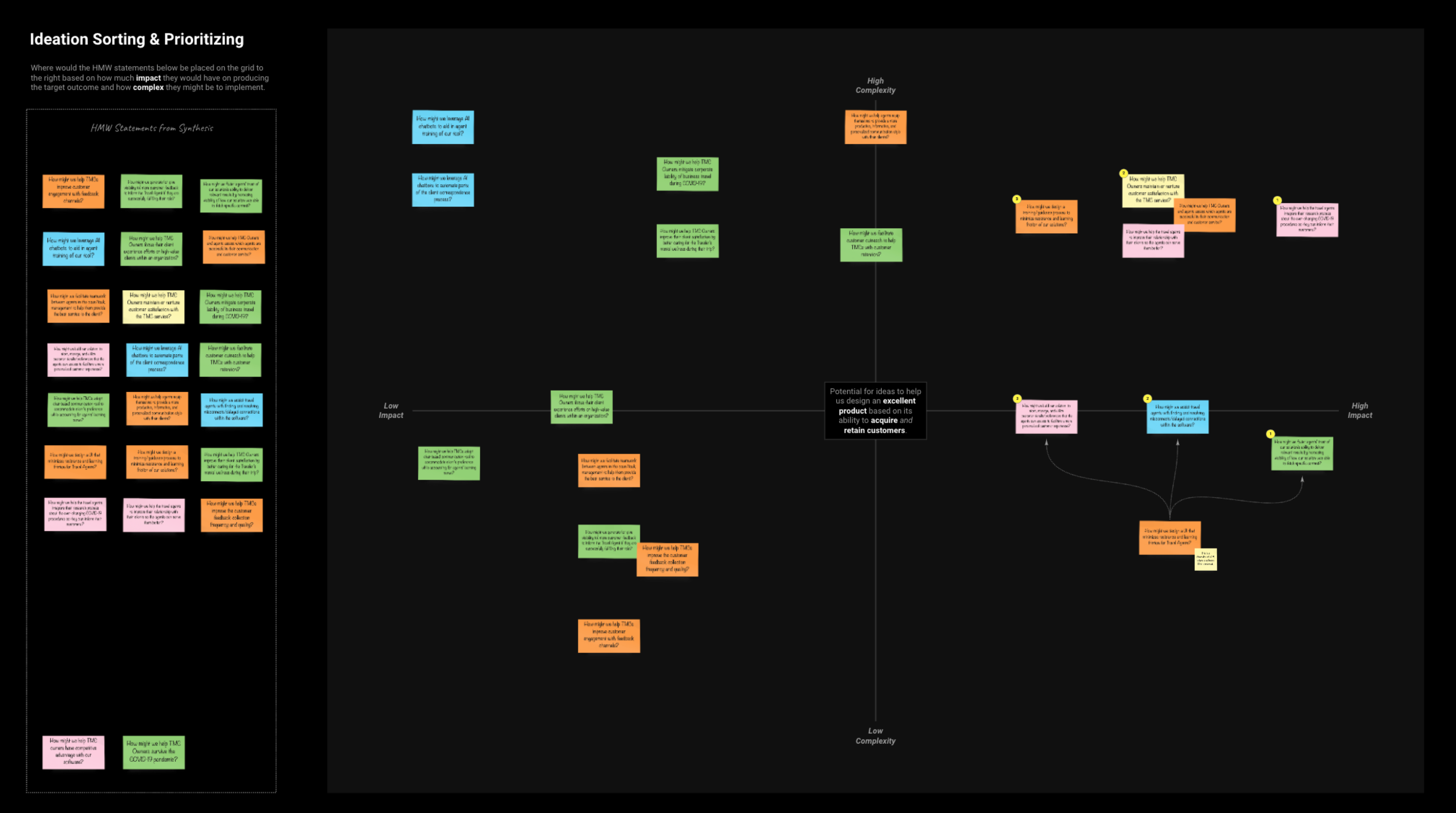
- Quadrant Mapping - to assess the weight of our customers’ concerns
- Dot Voting - as a prioritization exercise
Prioritization
Now that we had our key problems areas visually laid out in an organized fashion, we just needed to figure out which of these problems should be prioritized.
We conducted a sorting exercise, placing the How Might We statements onto a quadrant map after assessing their complexity and impact.
We decided to focus on a problem statement that had high impact and low complexity to see what solutions we could implement in the short term that could greatly impact usability (the lower right quadrant). We settled on the following:
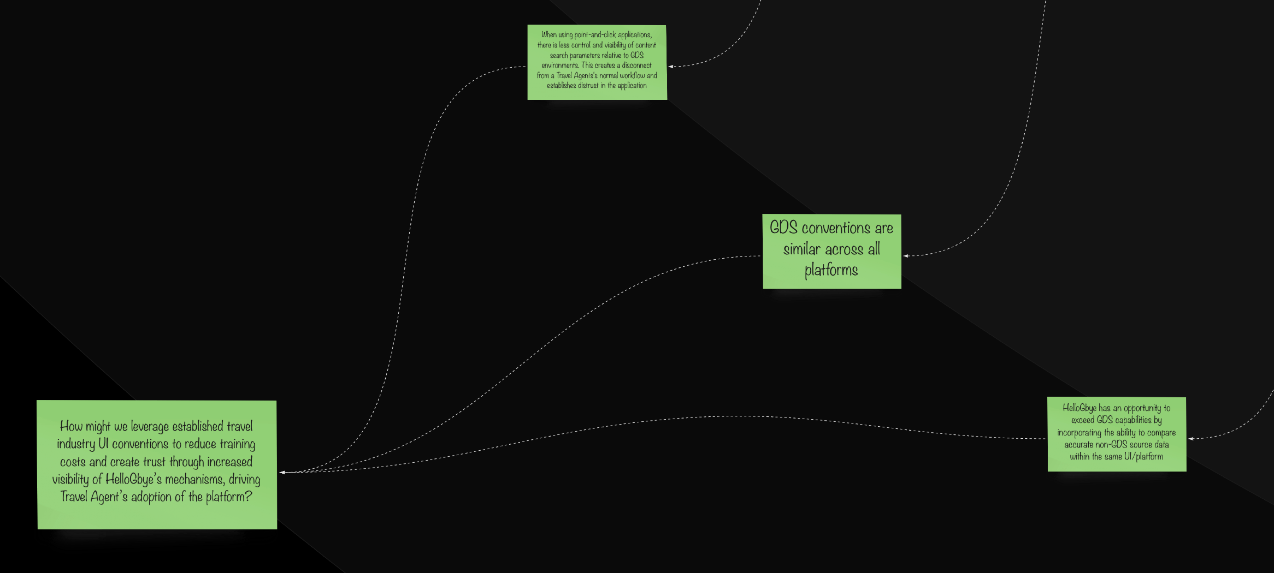
How might we foster agents’ trust of our solution’s ability to deliver relevant results by increasing visibility of how our solution was able to fetch specific content?
Ideation
With the burning question in mind, we needed to brainstorm solutions. Aside from the Product Owner, UI Designer, and UX Designer (me), we thought it would be best to enlist the help of additional team members for more diversified perspectives. Specifically, we extended invitations to:
- one of our back end developers for his knowledge of our platforms’ functionality and architecture
- a travel agent who had experience working with both GDS systems and the HelloGbye platform
Session
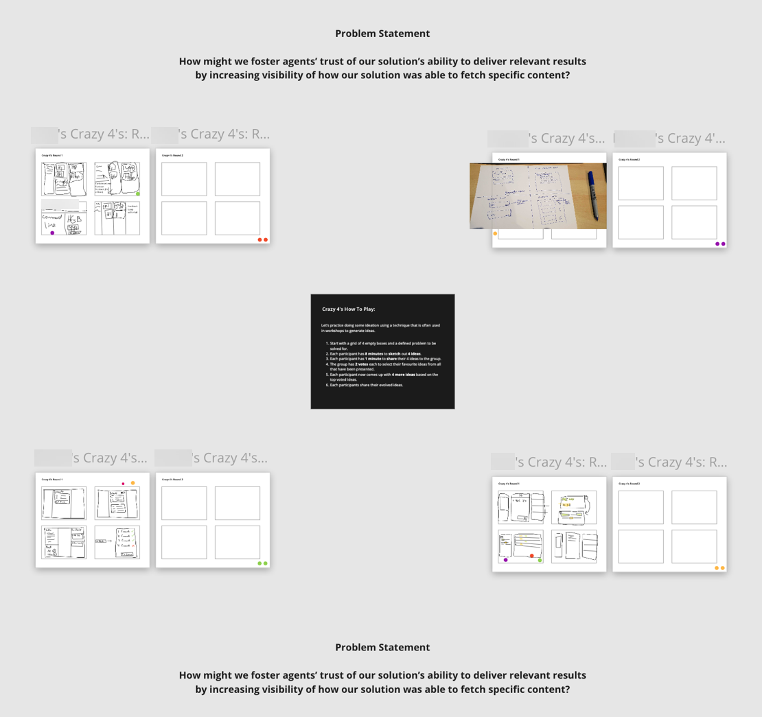
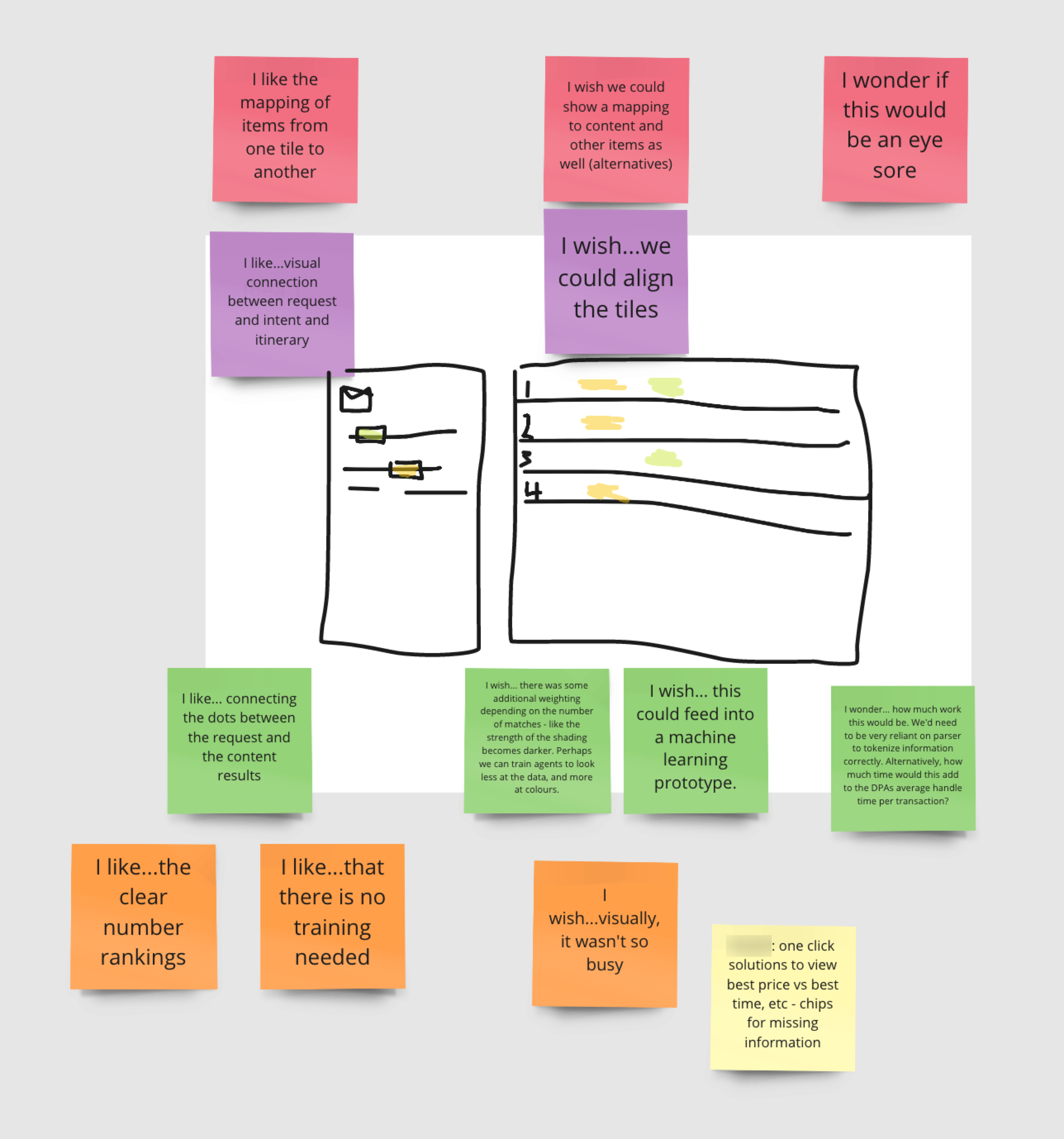
Each of the participants sketched four ideas for a possible solution to the How Might We statement within a time limit, then dot voted our preferences with explanations.
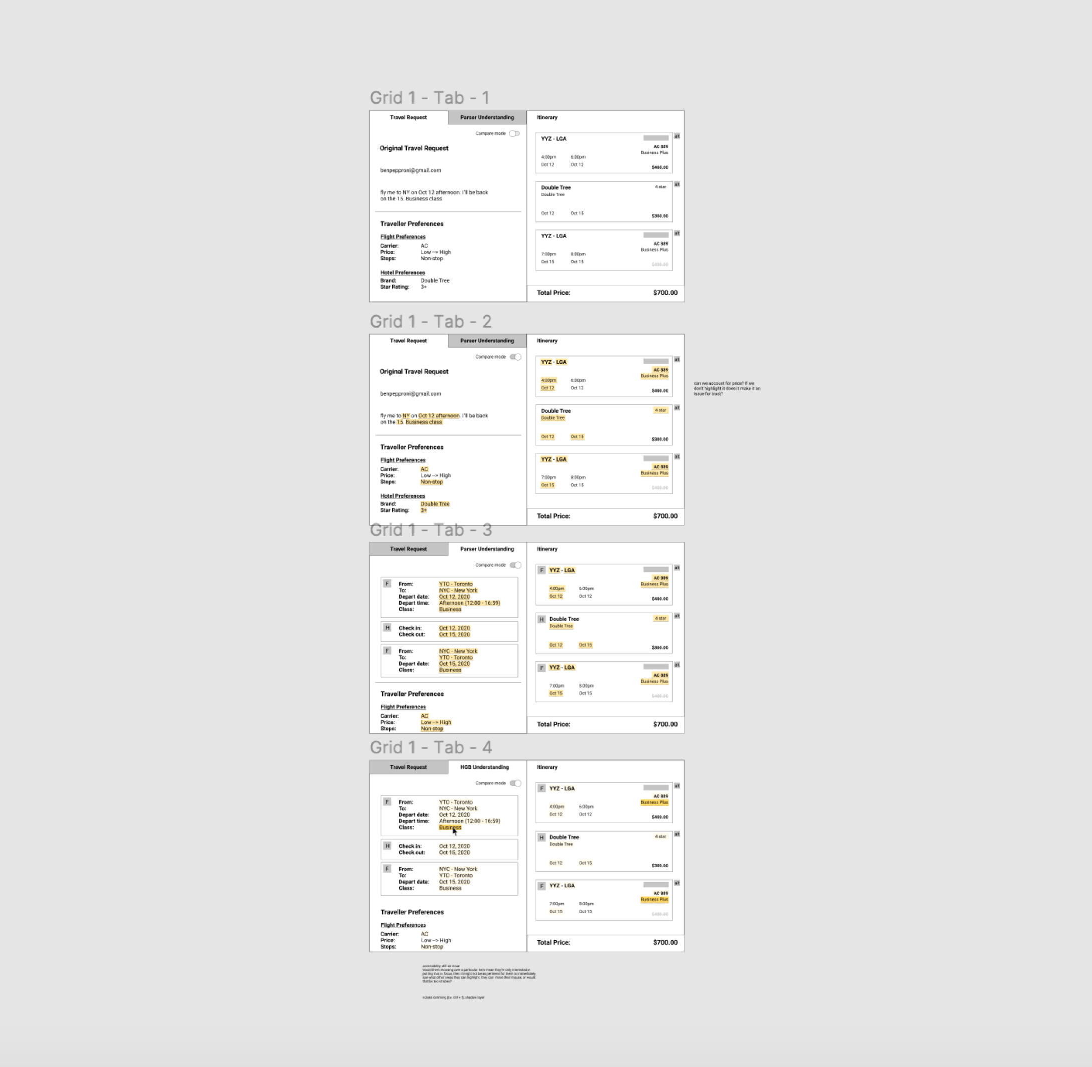
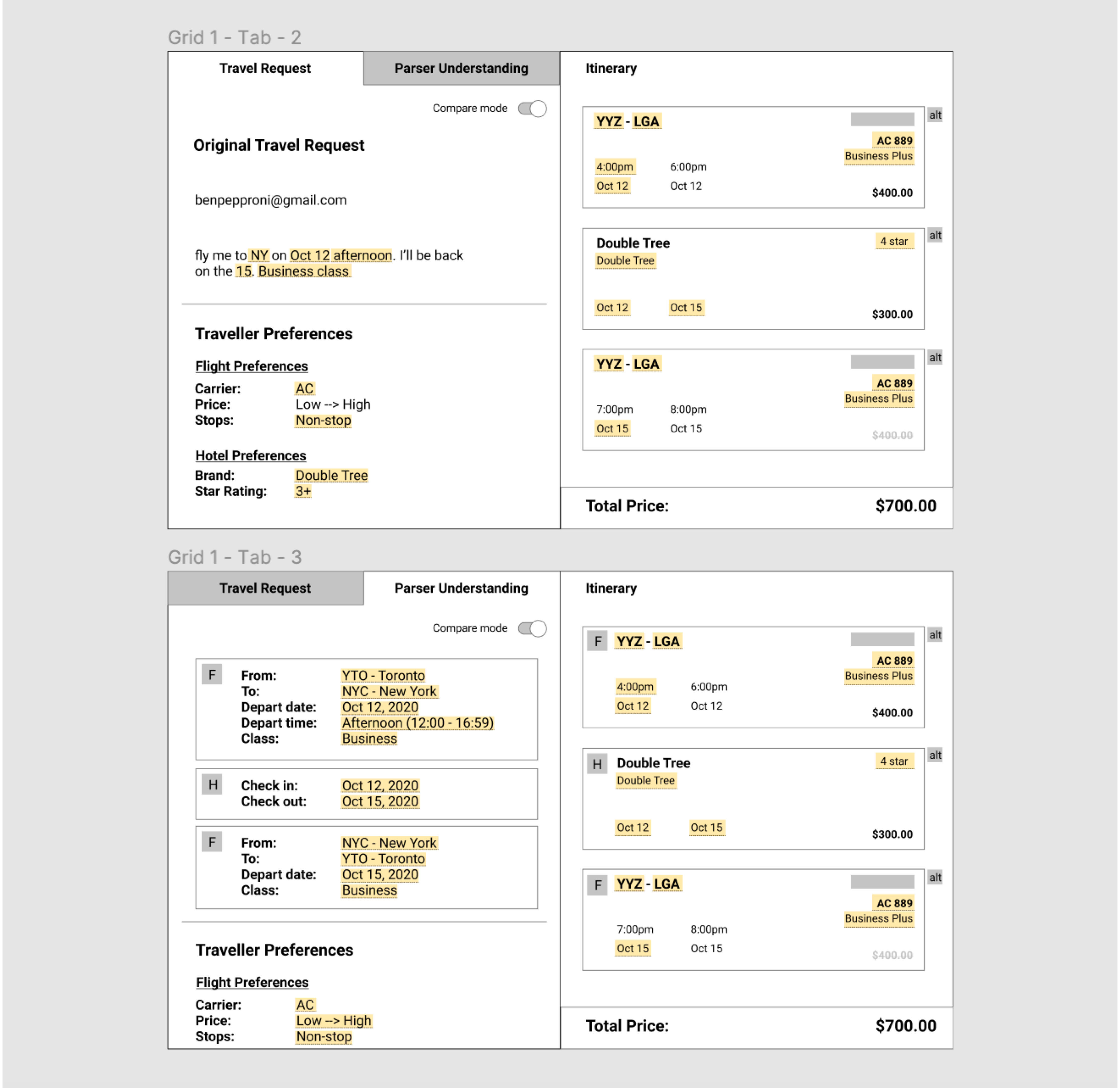
The solution we decided to move forward with we called “colour mapping”, and involved visually highlighting tags on the original travel request that the AI had found, and the matching criteria on the itineraries generated. (This will be explained in further detail in the Protoyping section)
This solution was prioritized over others because:
- It leveraged our existing UI and AI tagging capabilities, meaning it would not be a huge strain on development resources.
- It allowed a large opportunity to use UI to teach the users how to use the platform, thereby potentially reducing learning friction.
- It focused on showing the users how and why the AI had recommended an itinerary to them, therefore invoking feelings of trust through transparency.
Prototyping
Context: Previous Design Layout
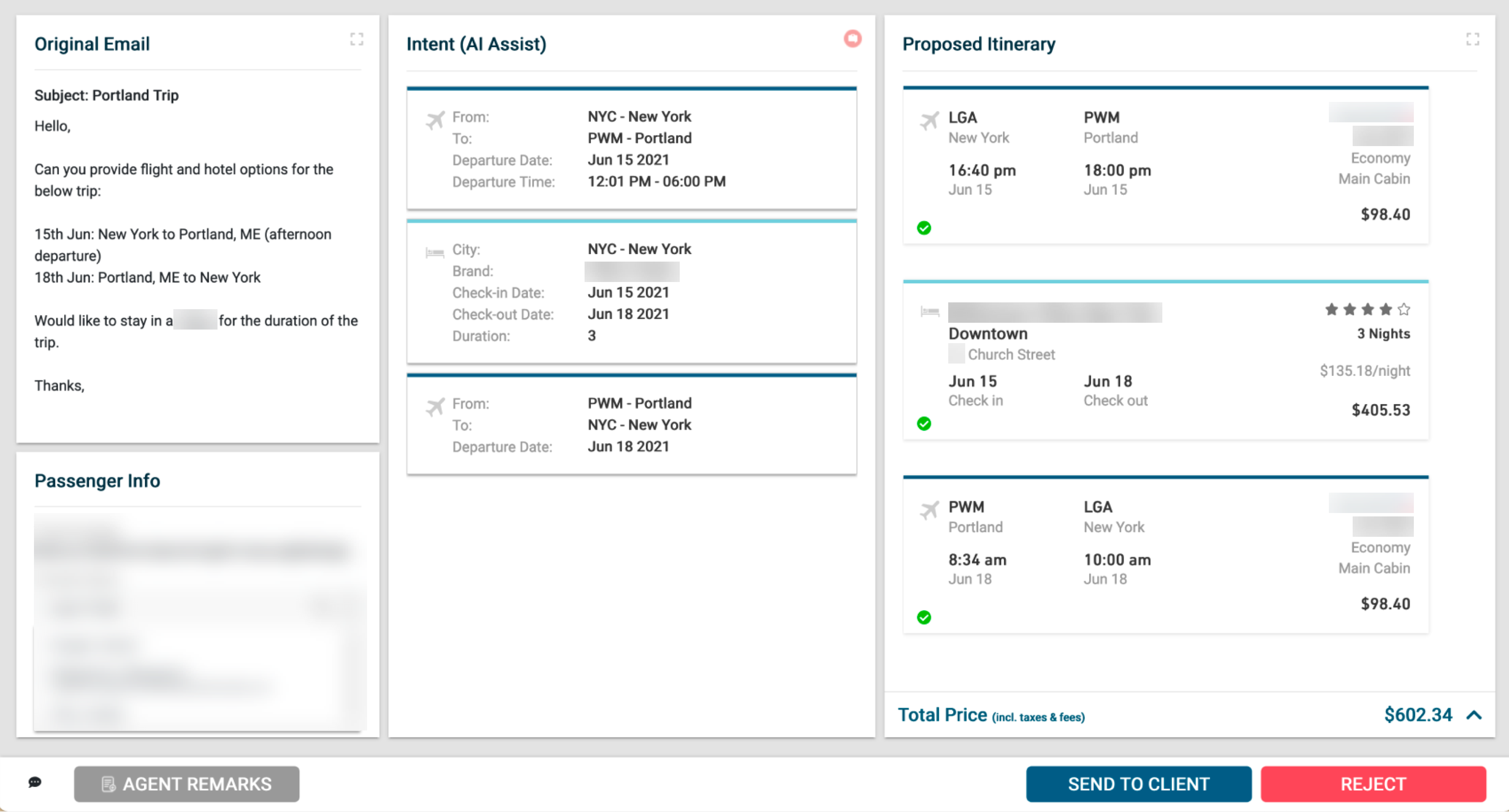
The existing design featured a three panel display, showing the original travel request (email), the information that our AI picked out from the email, and the recommended itinerary. Here were concerns we had:
- it was a lot of information to view on one page, and took away valuable real estate from other functions
- it was based on the assumption that it would boost agents’ trust in our platform, since they would be able to see the information our platform used to run the search
- User testing and interviews revealed users were confused by the middle panel, and rarely accessed it
Reorganizing the Panels
Due to the issues regarding the middle column in the existing platform, our idea was to reconceptualize the third panel like a checkout section, and we could explore narrowing or prioritizing the focus of the page’s available functions. The mockups we ended up moving forward with used a two-panel display.
We combined the travel request and AI understanding under one panel, organized by tabs.
Colour Mapping
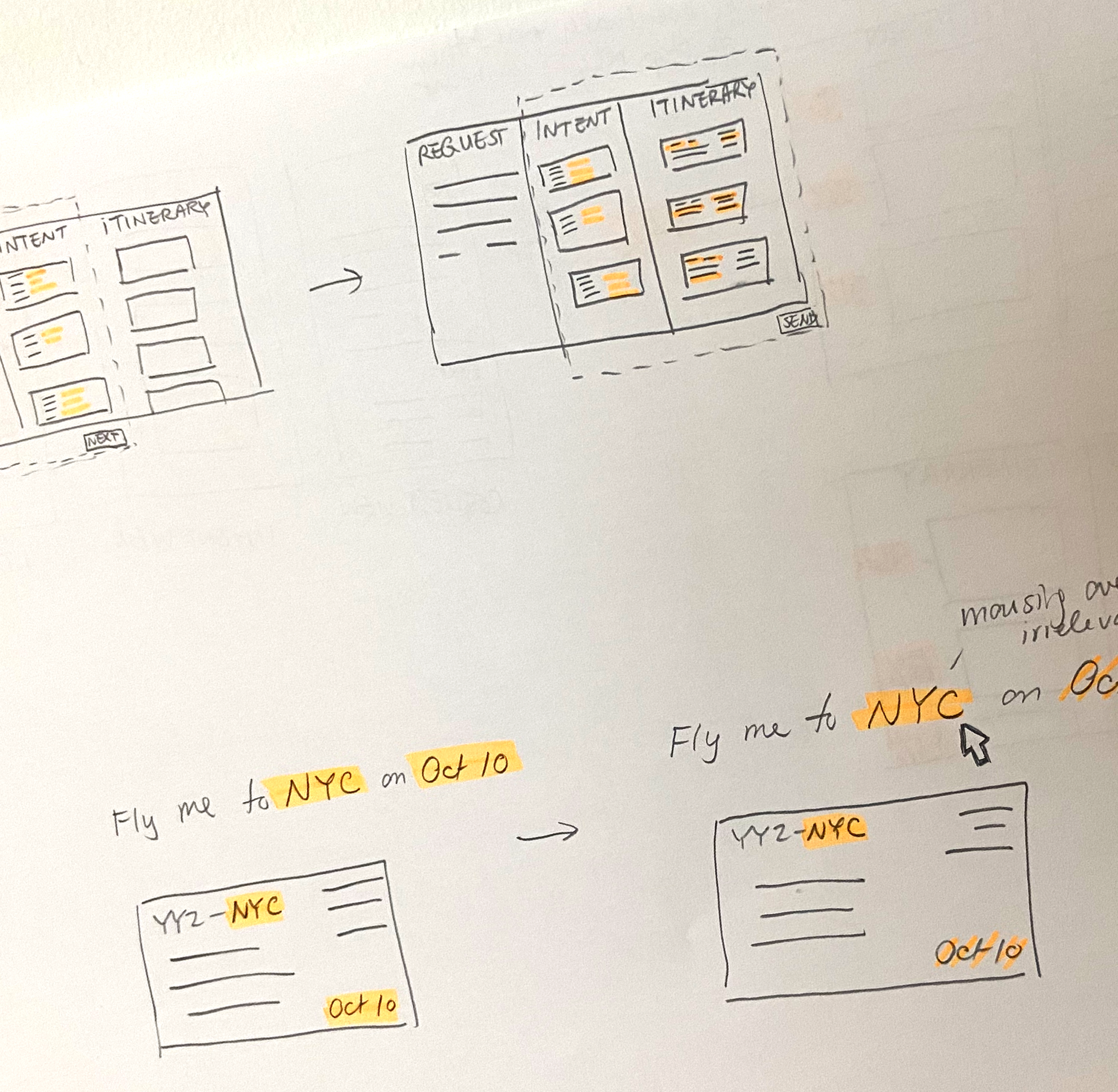
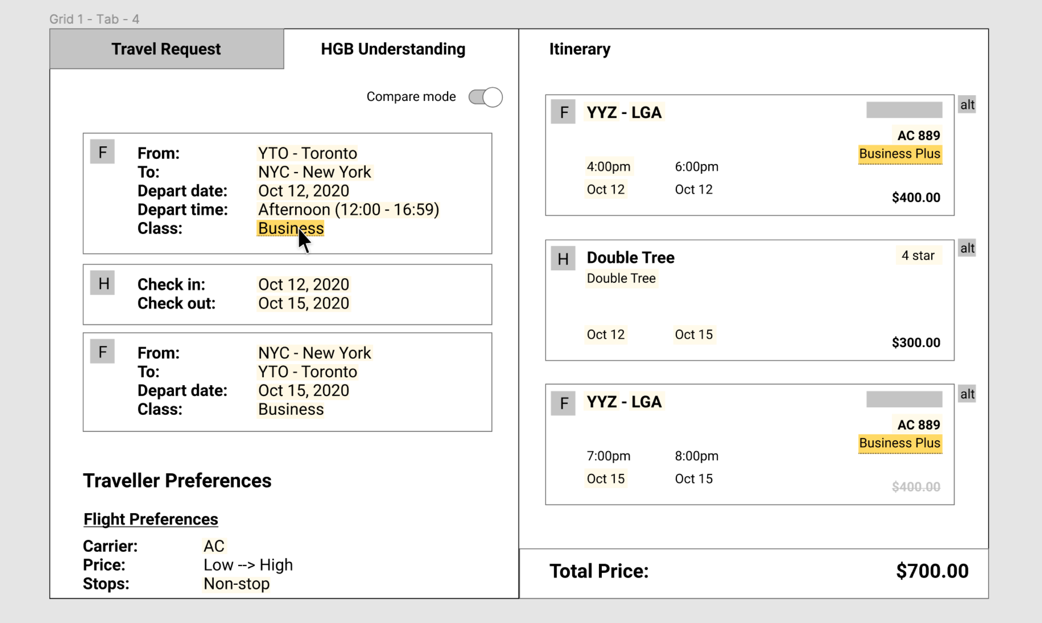
The basic premise of “colour mapping” is the use of coloured highlights to visually indicate to users whether the AI had picked up on the correct information to produce a recommended itinerary.
The goal of incorporating “colour mapping”, or coloured highlights to matching information, was to allow for two things:
- Ease of information comparison: When users hovered over one item, it would dim any highlights that were unrelated, leaving only the relevant information prominently displayed for comparison.
- Instill trust: We hoped that in time, users would not turn to manually verifying that the information was correct, and trust would become instinctual - that the presence of highlights at all would let them know that the AI had done its job.
- Instill trust: We hoped that in time, users would not turn to manually verifying that the information was correct, and trust would become instinctual - that the presence of highlights at all would let them know that the AI had done its job.
Next Steps
Several sketches and prototypes were weeded out from the feedback during the follow-up session. We need to validate if the ideas we proceeded with help us address our How Might We statement. Our next steps would involve bringing these prototypes to our users (travel agents) for testing the following features through observational testing and interviews:
- Colour mapping vs. no colour mapping
- Three panel view vs. two panel view
- Tabbed approach vs. sliding approach
Takeaways
Times of uncertainty also leave room for opportunity.
COVID-19’s impact on the day-to-day workflow of our users left gaps in our users’ workflow and uncertainty of the future. Needs that previously went unnoticed were now at the forefront. Inefficiencies in the workflow were now exacerbated. Shifts in our customers’ strategies means that there is more to uncover, and more areas we could design solutions that drive the industry forward.
Design your research participants’ experience.
Areas where we anticipated and prepared for our participants questions, confusions, or overall experience were met with praise and greatly improved our ability to manage our time. Things like including an icebreaker at the start of the meeting, preparing slide decks, or virtual work stations with clear instructions kept things organized and also instilled trust in our ability to lead these sessions.
Wherever we failed to do so, we noticed more hiccups, awkward pauses, repetitive questions, and in the worst cases, participants dropping out entirely.
Flying blind will eventually catch up to you.
Given that this research project was the first of its kind at HelloGbye, we felt like we were operating blind. It was a massive undertaking and wake-up call for us to sift through and digest the mounds of valuable information we gained from this one project alone. It really emphasized the importance of regularly conducting user research and testing to validate our next moves and to be able to make data-based design decisions.
Thank you for reading!
Fontaine Choy © 2024

